Build beautiful interfaces, fast.
Kinetik is a set of free, open source React components built with Tailwind CSS and Motion. Add one with a single shadcn command, make it yours, and ship consistent UI without starting from scratch.
Components
Every component ships with a live preview, the source, and the variants you need. Pick one and drop it in.
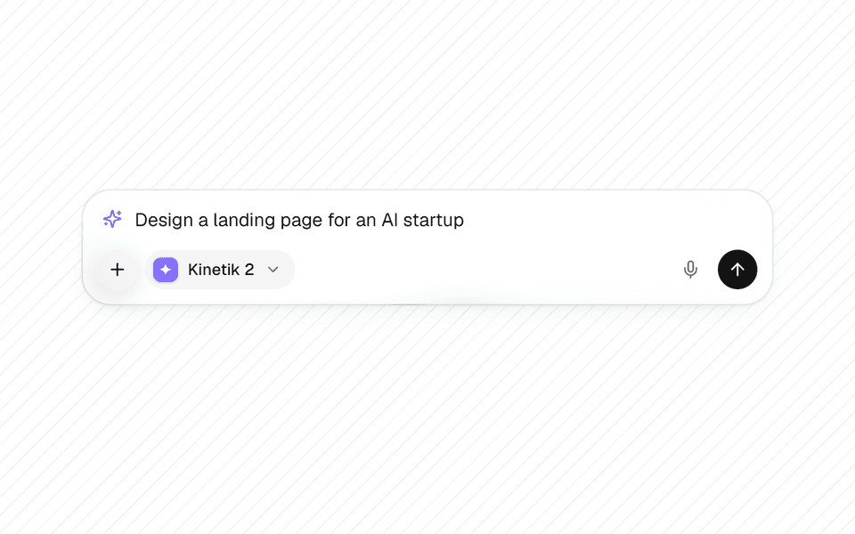
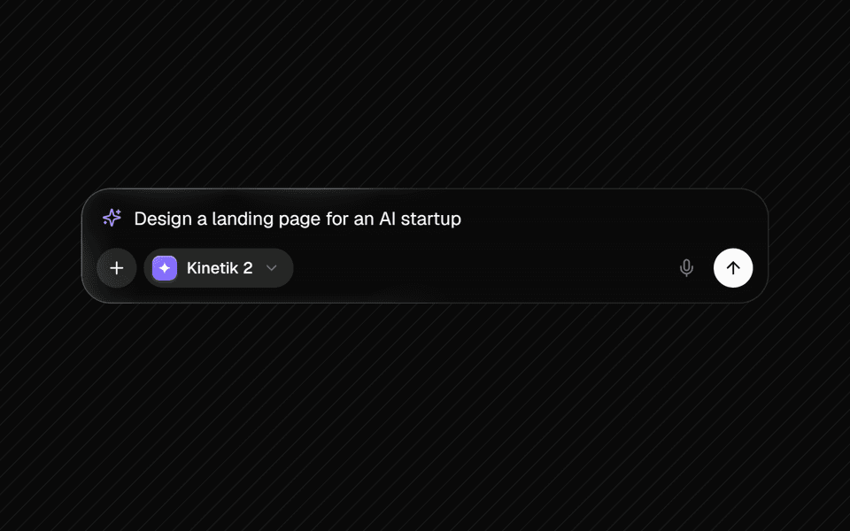
Prompt Input
A clean AI prompt box that grows open on focus, lit by a Beam border glow, with a ChatGPT-style + menu, model picker, attachments, voice input and run / stop.
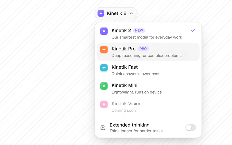
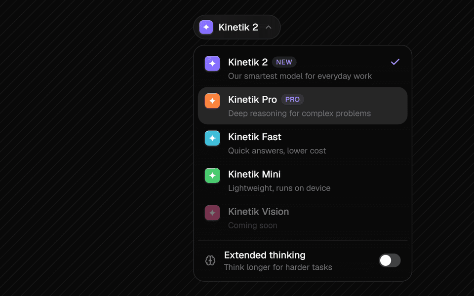
Model Selector
A compact model picker for AI apps with glyphs, badges, a sliding highlight and an optional extended-thinking switch.
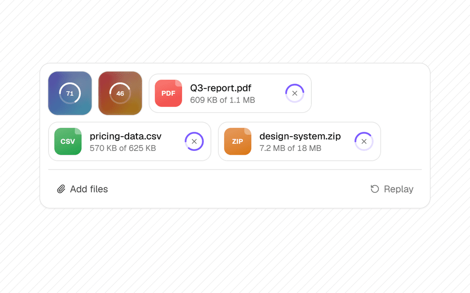
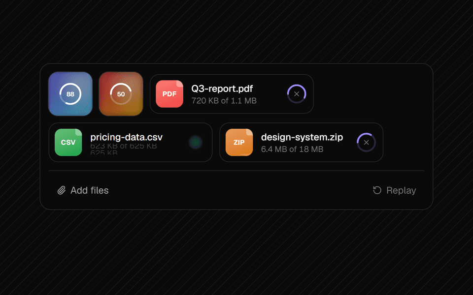
File Attachment
Attachment previews for uploads, with a springy progress ring, a check on finish, cancel, retry and remove.
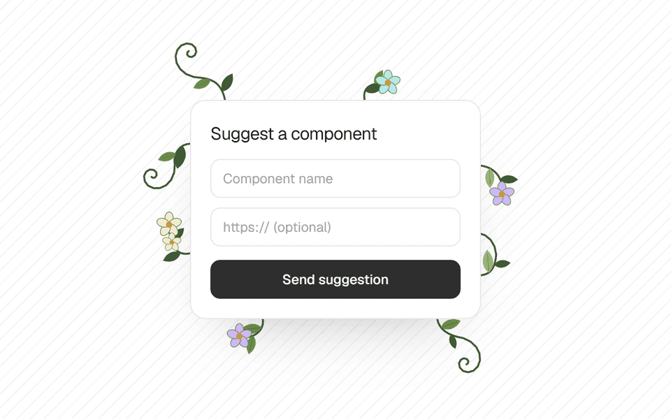
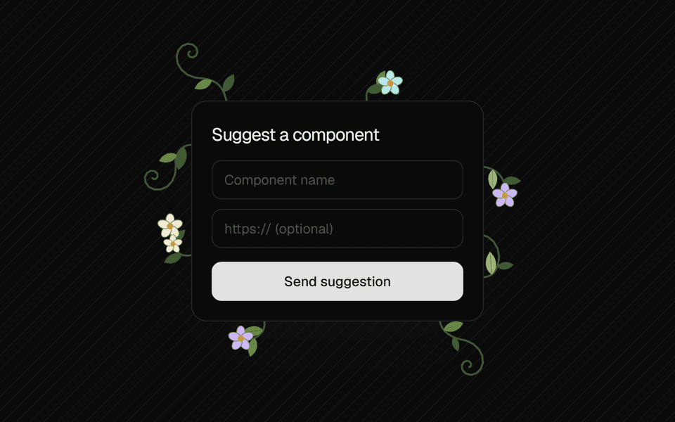
Organic Growth
Wrap any element and vines, leaves and flowers grow out of its edges on hover or focus.
Resources
Built on good tools.
Kinetik stands on a small, boring-in-a-good-way stack. Next.js, Tailwind CSS and Motion do the heavy lifting; the rest handle docs, scrolling and icons.
- Next.jsFramework
App Router, server components and static docs pages.
- Tailwind CSSStyling
Every style, driven by the --ui-* design tokens.
- MotionAnimation
Springs, layout and gesture animation in components.
- FumadocsDocs
MDX docs pipeline
- ShikiDocs
Code highlighting
- GSAPAnimation
Scroll-driven templates
- LenisAnimation
Smooth scrolling
- LucideAssets
Icons
FAQ
Good questions.
The things people ask most about using Kinetik in real projects.
Is Kinetik free to use?
Yes. Every component is MIT licensed, so you can use it in personal and commercial projects without paying or asking. Attribution is appreciated but not required.
How do I add a component to my project?
Run the install command from its docs page, e.g. npx shadcn@latest add https://kinetikui.vercel.app/r/segmented-nav.json. The shadcn CLI adds every file, the npm packages and any Kinetik components it builds on. Prefer to do it by hand? Switch the preview to Code and copy the files instead. Either way the code lives in your project, with no package to keep updated.
What do the components depend on?
React and Tailwind CSS, plus Motion for the animated ones and Lucide for icons. The shadcn CLI installs whatever a component needs, and each docs page lists it too.
Does it work in dark mode?
Yes. Components use the design tokens (--ui-*) for colour, so they follow your light or dark theme automatically. Try the toggle in the top bar.
Can I change the styles?
The code lives in your repo after you install it, so change anything. For site-wide changes, edit the tokens colours, spacing and type scale all come from one CSS file.
Can I request or contribute a component?
Please do. Open an issue with the idea or a pull request with the component and its MDX page on GitHub new components show up in the catalog automatically.